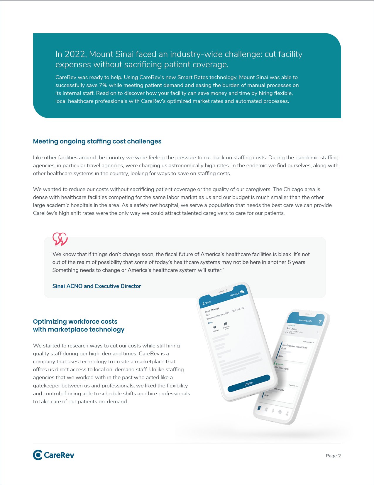
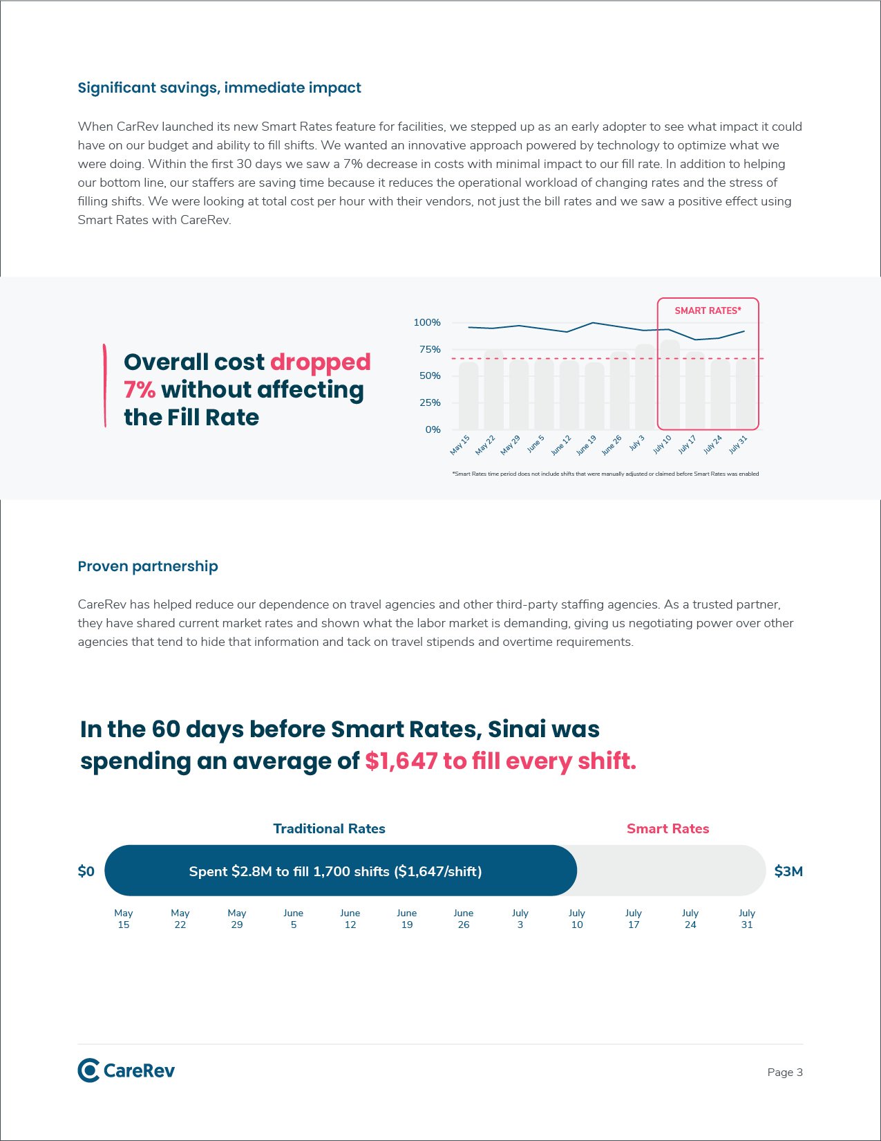
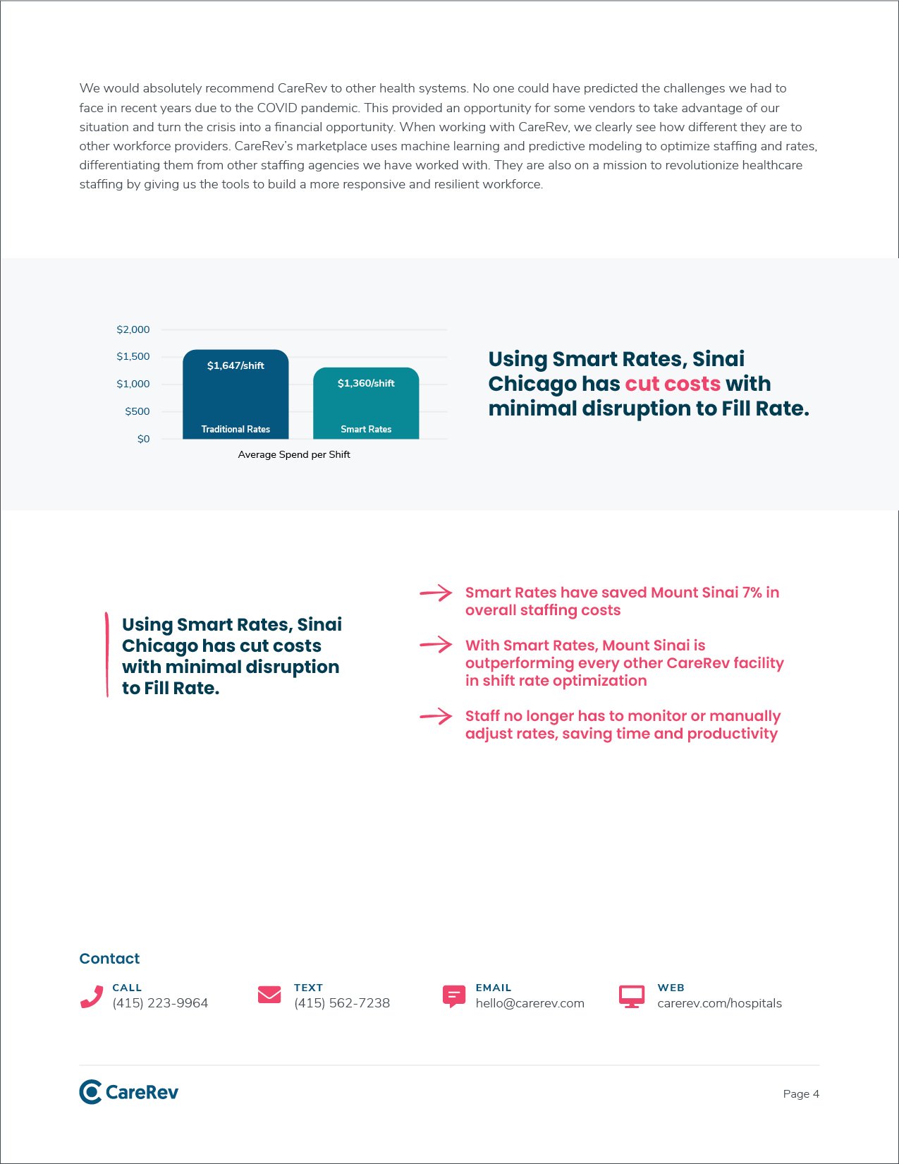
CareRev
Company Rebrand
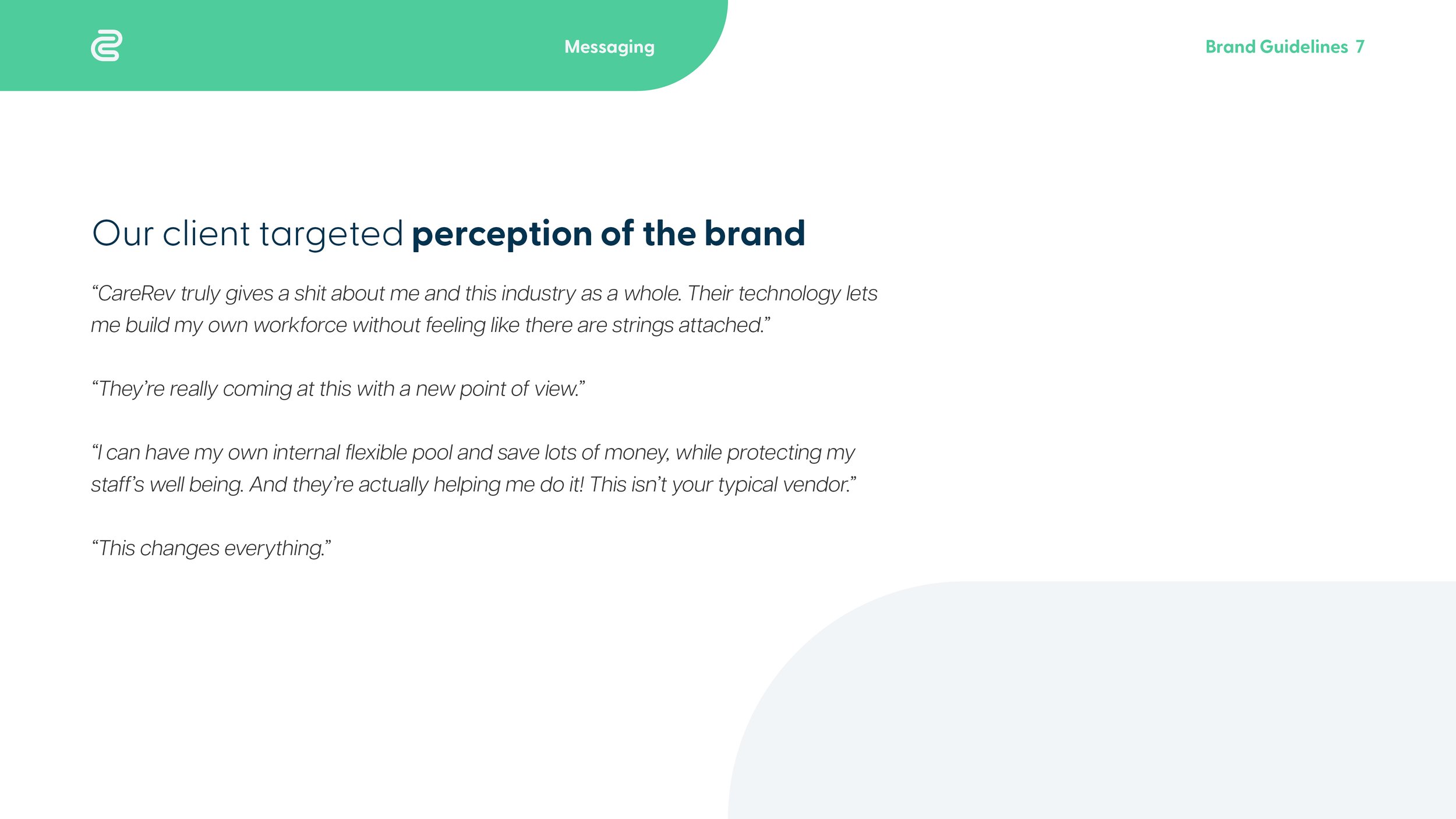
Shifting the brand from being perceived as a staffing agency to a flexible workforce solution. While CareRev does fill staffing gaps well, we now provide a plethora of solutions that empower healthcare facilities to use technology to eliminate many manual processes, combat burnout, depend less on premium labor and ultimately enable better patient care. We needed this full story to come through in our brand story with a foundation based around bringing hope to a post-pandemic-exhausted industry.
Before

After

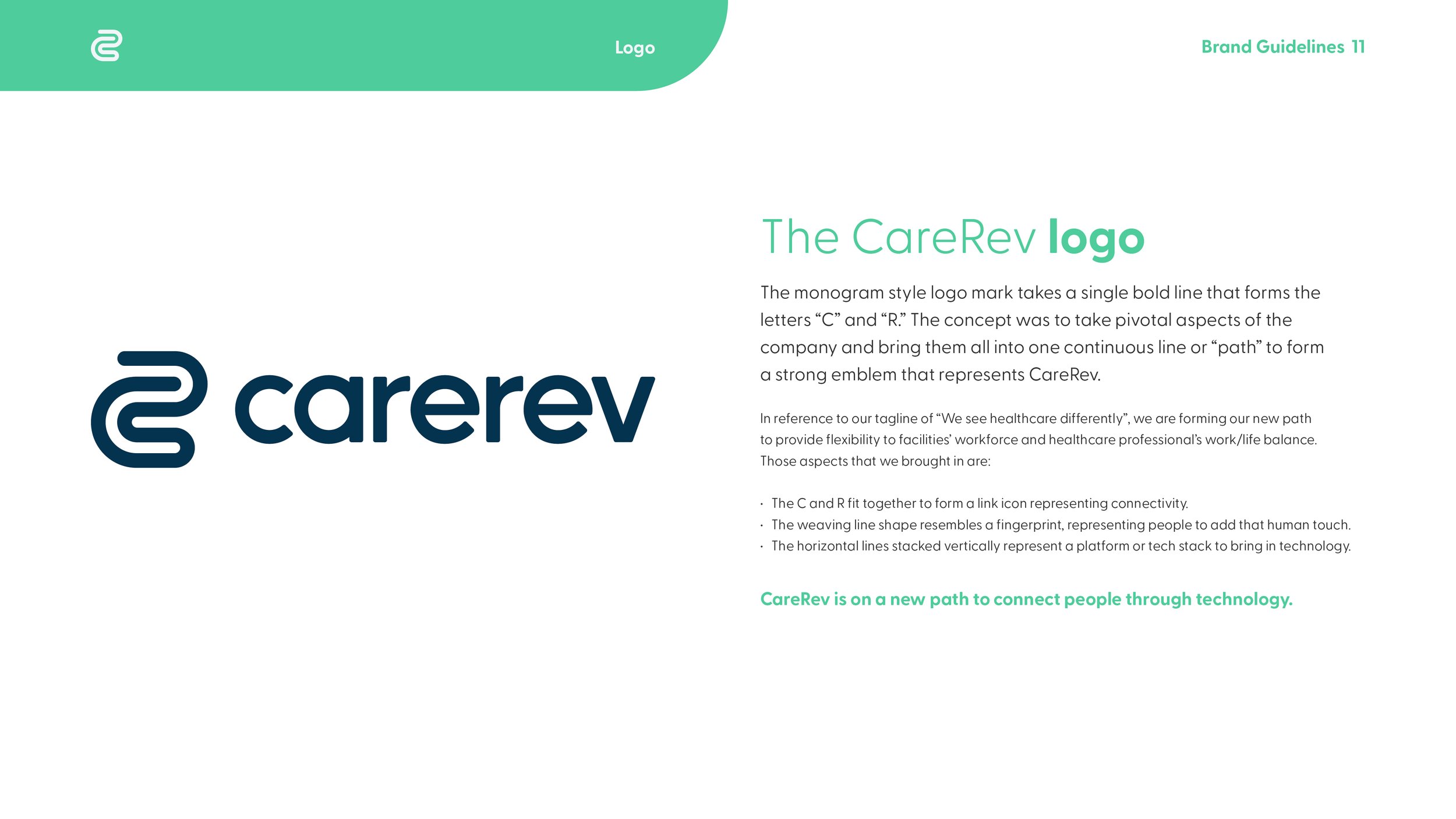
The monogram style logo mark takes a single bold line that forms the letters “C” and “R.” The concept was to take pivotal aspects of the company and bring them all into one continuous line or “path” to form a strong emblem that represents CareRev.
In reference to our new tagline of “We see healthcare differently”, we are forming our new path to provide flexibility to facilities’ workforce and healthcare professional’s work/life balance. Those aspects that we brought in are:
- The C and R fit together to form a link icon representing connectivity.
- The weaving line shape resembles a fingerprint, representing people to add that human touch.
- The horizontal lines stacked vertically represent a platform or tech stack to bring in technology.


Previous work
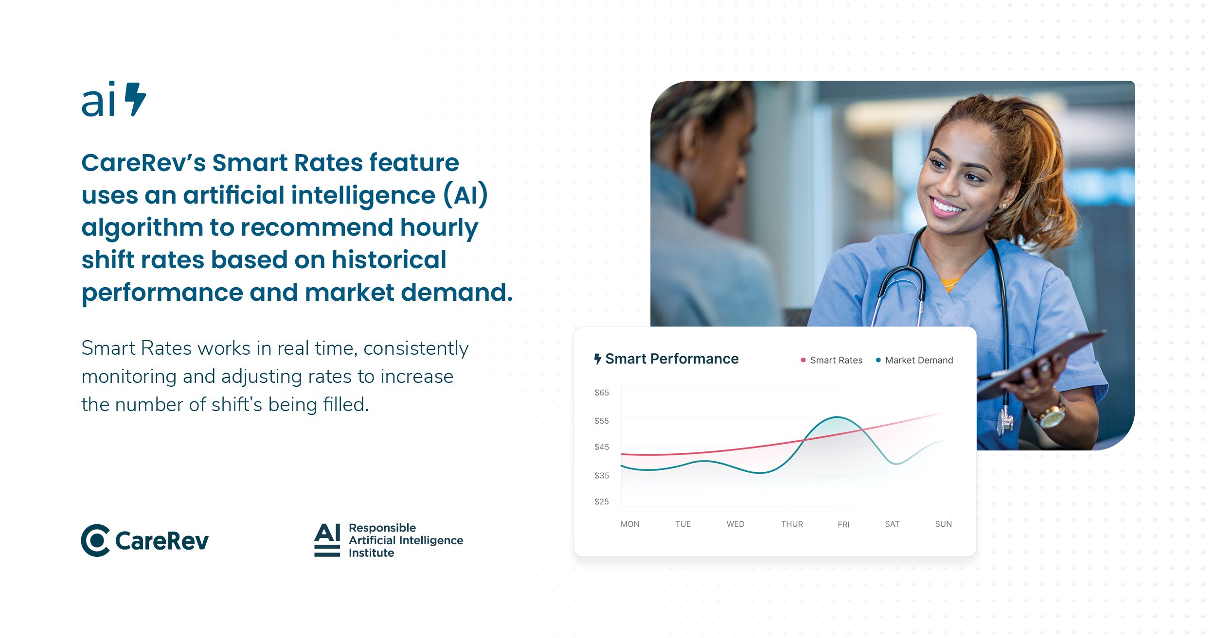
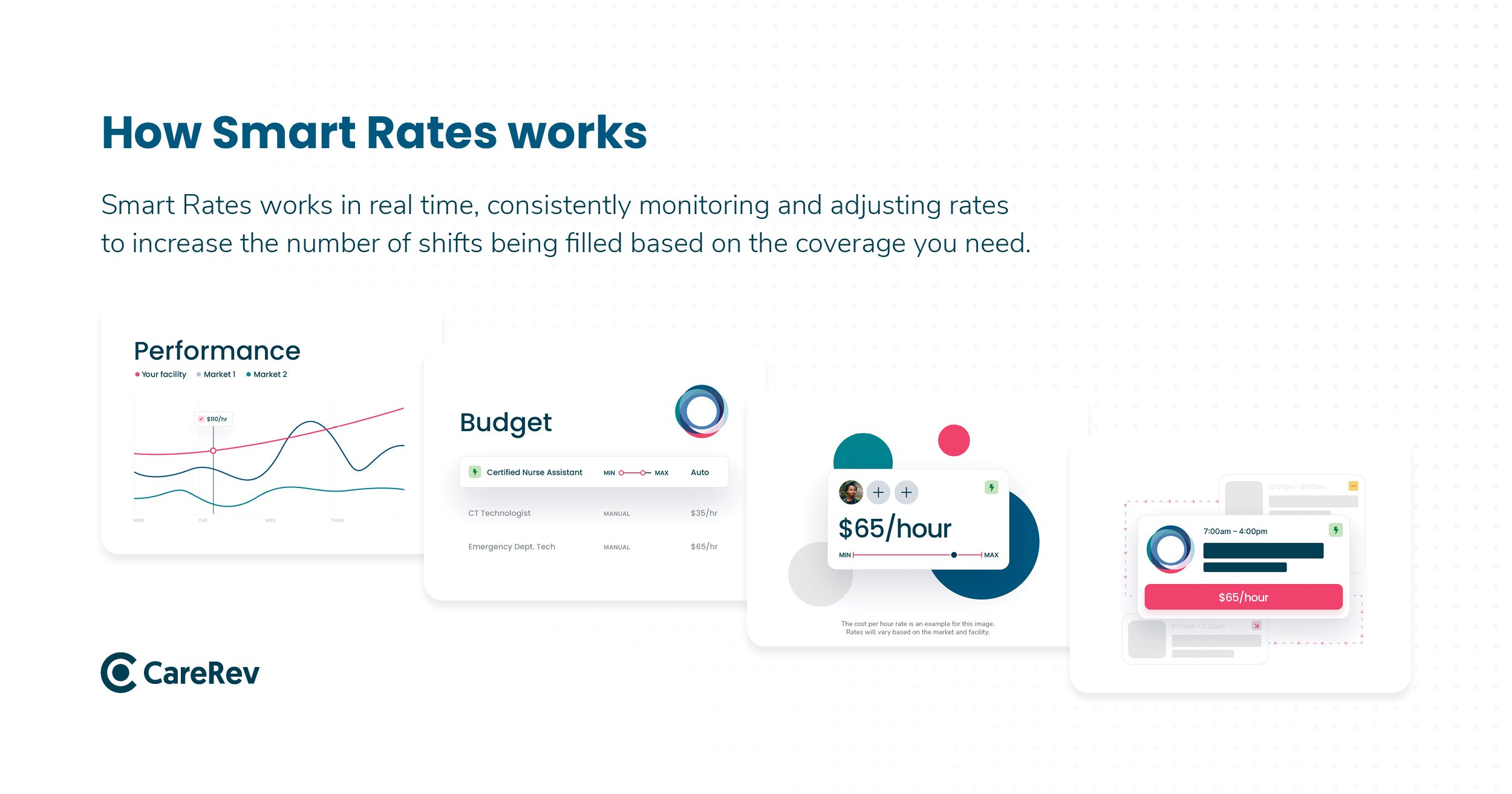
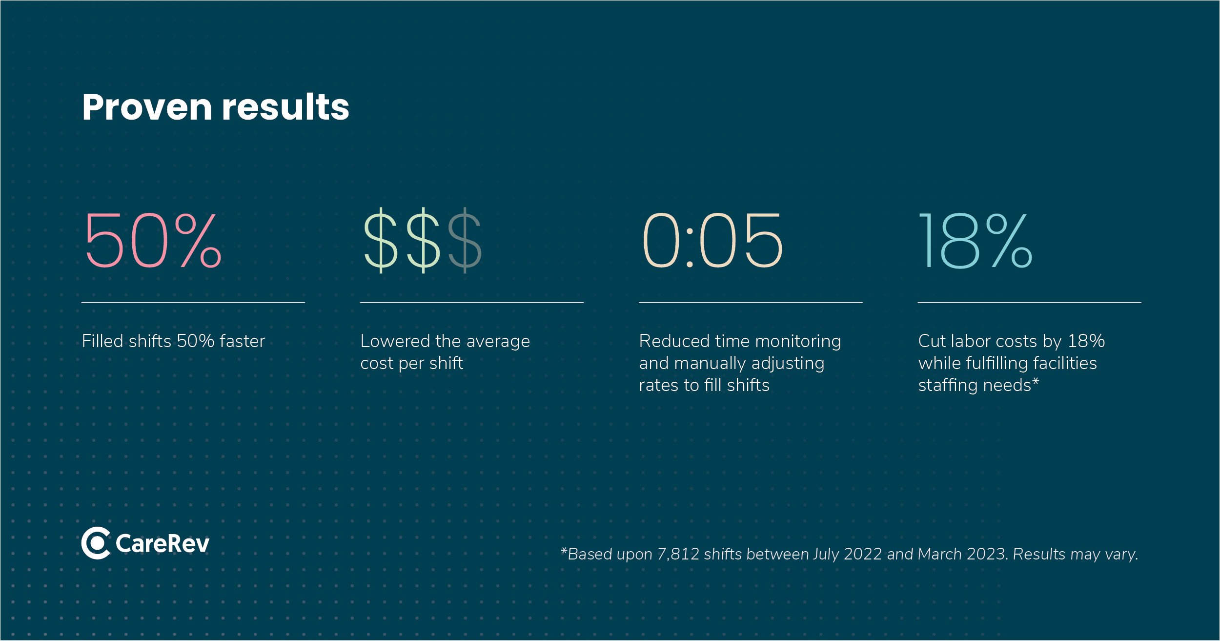
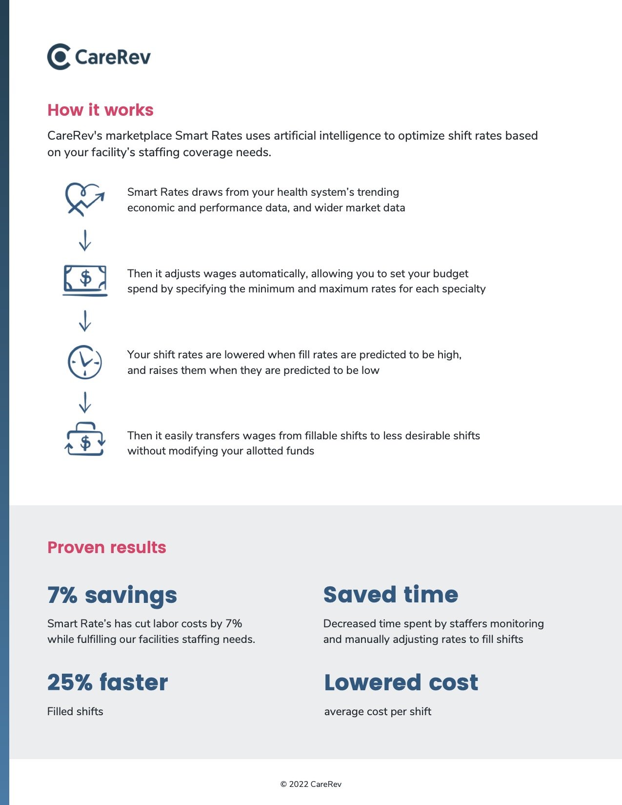
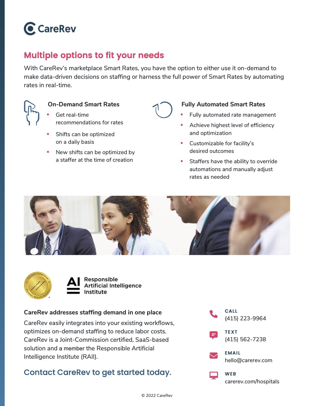
Smart Rates Product Launch (Social video, Case Study, Sales Sheet, Banner Ads)